TL; DR
If one understands technical analysis and how to read between the lines, market charts can provide a whole range of exciting narratives about where prices have been and where they might be going next.
As the crypto markets begin to slowly mature, we are increasingly gaining access to more historical data that technicians can analyze to decipher patterns and predict the future.
One such example is a recent series of findings by crypto market analyst Willy Woo. Woo shared a variety of charts showing Bitcoin valuation metrics over the cryptocurrencies for its entire ten-year history (from 2009 to 2019). Each chart displays the progression of a metric about the market valuation of Bitcoin over the past ten years. We’ve shared some of the most notable charts below:
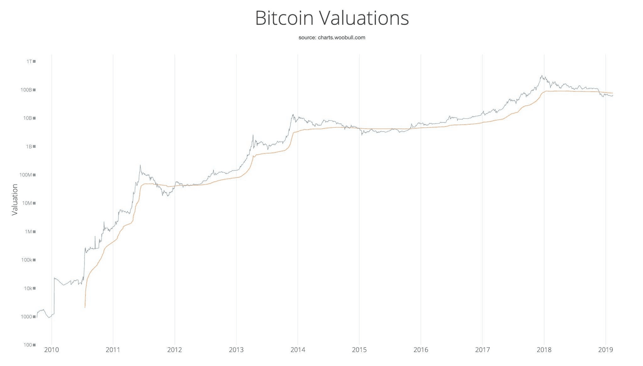
The first metric is Realized Cap (RV), which approximates the aggregate value paid for coins in circulation.
RV is the orange line, while the blue line is the market valuation of Bitcoin.
What this chart reveals is that during each bull cycle, we can see a fast climb from the orange line, which signals new investors jumping into the market and buying at the latest prices. The latest trend shows a flat line for RV, which has historically been a precursor to a surge in prices.
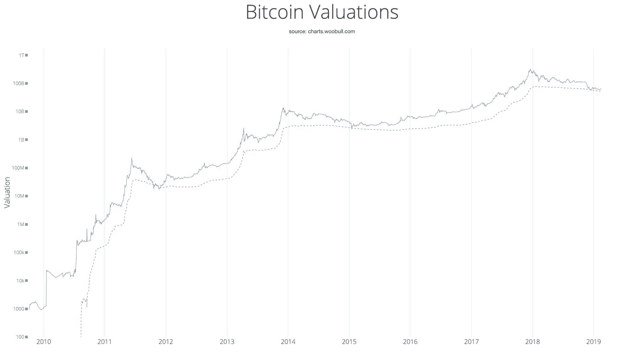
The second metric is Thermo Cap (the cumulative security spends by the network). This tracks the maximum amount of capital that has entered the market over time.
The chart shows that we have not yet exceeded $10billion entering the Bitcoin market. This gives us a strong indicator of how early it could be for the crypto markets.
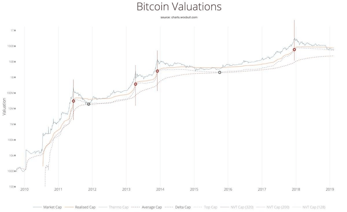
The third (and possibly most interesting) metric is what comes out when combining the moving average of the Bitcoin’s market cap across the entire time range, and subtract it from its realized market cap. The result is called the ‘Delta Cap,’ which is a metric that also used to identify all of the historical market cycles’ bottoms for Bitcoin:
When we add an oscillator setting, we get to see how the Delta cap shows what stage we are in the market cycle:
Delta Cap is the purple dotted line in between the yellow (Realized cap) solid line and the red dotted line (Average Cap). Every time the Delta cap touches the Realized cap, Bitcoin’s valuation hits the top of the market cycle, and every time the Delta cap touches the Average cap, Bitcoin’s valuation hits the bottom of the market cycle.
Based on what we see in the late 2018/2019, we may still have a while to go before we hit the bottom of the current market cycle and start making our ascent upward.
Overall, charts like these are great examples of how traders can try to create predictions of future price action based on access to a broader history of the market data, pattern recognition and a solid understanding of technical analysis.